Call Us For Assistance – DO NOT RETURN TO STORE

Trike instruction booklet

I just got this sweet trike for my kid and there are like 20 steps to put it together. Anyway, I got stuck and my first reaction was to just return and move on with my life. However, I saw the instruction booklet told me to call them first instead of returning it.

They talked me through it, they were super nice, and now I’m a happy trike bike owner!

I thought that big bold phone number was super smart. Most people don’t know this but when you return an item to the store. The manufacturer gets it pretty bad, here is what happens in most cases (specifically for the smaller guys):

  1. The retailer ships it back to you and charges you a bunch of fees (sometimes equivalent to the amount of the product)
  2. You give the retailer a complete refund

By adding this phone number the retailer probably just saved them 2X the cost of the trike.

Loading…

Netscape LoadingI’m not sure what it is but I really enjoy watching things get uploaded… you know the bar that shows you the progress of where your upload is. The first time it was used was in Mosaic to indicate to their users “Hey, don’t give up on me. We are loading the webpage.”

We’ve come a long way since Mosaic. I wanted to take a look at things other sites do while the website is in a loading state.

YouTube Leverages Loading Time to Get SEO Juice

That is why I thought it was pretty brilliant to see how YouTube leverages their loading time to get you to add a description, tags, and categorize your video. By the time your video is fully uploaded you probably already entered in all your information.

Screen Shot of YouTube when the video is uploading

HipMunk Shows Me Tips

Screen shot of Hipmunk loading

Gmail knows its slow so they show me a preview of my email with a loading bar

If You Have To Fake It

If you don’t have the time to add in something cool. Please make sure you add a progress bar (if you have to, fake it by estimating the average time and having a bar load for that long) or something that shows some progress. If you don’t have one I’m going to think the upload failed and move on.

What if I don’t have any loading time?

Then… you win! Nobody likes loading time. Google has reported that if the search results take longer than 3 seconds they see a significant drop off in user engagement, which is why they limit the first page to 10 results.

TaskRabbit – What Craigslist Should Have Been

I had no time and desperately needed to get my laundry done yesterday (I was down to my last pair  of underwear!). So I do what I always do when I need some extra help, turn to Craigslist.

I went to the Craigslist section and all of a sudden finding someone to do my laundry became a daunting task. Writing out the job description, figuring out how much I should pay, and then also picking the right person – after all, I wanted to avoid all the weirdos that want to sniff my underwear. Luckily I remembered a friend mentioning TaskRabbit to me.

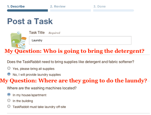
TaskRabbit is one of the best web applications I have used in a really long time. They made the entire process a no-brainer. Below are the details of what they did exceptionally well.

1. TaskRabbit already knew the top things people ask for. They made it really easy for me to select “Laundry”.

2. Next they answer all the questions I have before I even asked them.

3. This was probably my favorite thing: They show me how much I should pay. I really had no idea how much money to offer. (I decided to pay $41 because I was desperate).

4. I didn’t have to actually write any instructions. TaskRabbit allows you to use other peoples instructional templates and modify them to how you want. Luckily I didn’t even have to modify anything.

5. In minutes of posting my laundry job, I got an email from TaskRabbit saying a guy named Joel is willing to do my task! I was able to check out his profile and reviews to make sure he wasn’t a weirdo. I decided to give him the job (all it took was one click) – an hour later he was at my door… 5 hours later my 3 loads of laundry were clean, folded, and at my doorstep.

TaskRabbit really understands me. They know how lazy I am (for example I don’t even want to do my own laundry!) and so they make it just a few clicks to get the job done. I hope this post inspires you to look at your own company and strive for making it brainless easy.

Easy To Cancel makes it Easier to Sign Up

Don’t you just hate it when you have to mail in a letter or call a phone number to cancel your “Free Trial”? Chances are your potential customers do too.

The only way to combat this notion is to tell your customers how easy it is to cancel your service right when you ask for their Credit Card information.

This comment on Hacker News blew my mind:

“The reason I think long and hard before signing up for new web services isn’t even the cost 99% of the time, but the uncertainty in how difficult it is going to be to cancel should I decide I do not want to continue.” George McBay

Checkout what Netflix does to combat this:

Step 1: They don’t show the credit card form. They just want to grab your email address so they can send you marketing emails in case you don’t sign up on the 2nd step.

(click on image for a bigger image)

Step 2: Make it very obvious that your customer can cancel online anytime easily. {tweet}

Do you know other ways to combat the “It Sucks To Cancel” notion? Let me know in the comments.

Sales Copy Hack

Change your sales copy based on what your customers are saying.

Yesterday a customer asked if we had a “Virtual Vault” – a way to protect her digital files that she is selling. Technically we do, but we just didn’t explain it to her in ways she would understand. 6 simple words “Virtual Vault – Secure Digital File Protection” makes way more sense than our paragraph explaining our security features.

Getting Paying Customers is YOUR problem

You can’t expect your users to stumble upon paying you. Sending your users email reminders and navigating them through a series of steps that will lead them to paying you is key.

One of my favorite freemium website builders, Weebly, does an incredible job. Here is what they do:

Step 1: Get the Users Email Address

Weebly Homepage

Weebly tries to get you into an account as fast as possible. The free sign up form is right on the homepage, they don’t focus on making you watch the video or go to a “Pricing Page”.

Step 2: Create an Easy Hook to Get the User Engaged

Weebly's Welcome Message

Notice the stripped out navigation. Weebly only gives the user two options right after you create an account.

Option 1: Fill out your website title and the type of site you are  building

Option 2: Close the browser

The “Category” question is really interesting. This probably helps Weebly understand who their top customers are and helps them target future customers as well. Another side benefit is Weebly can tailor the user experience based on what category the customer selects.

Step 3: First Sell – Get Your Users to Buy a Domain

Step 3 Weebly Choose Website Domain

If you purchase your domain with Weebly it is a major lock in factor. People hardly ever get rid of the domains they buy. I like how they make this part of their on boarding process and the default option checks to see if you domain is available.

Step 4: Send Timed Emails to Remind Them of Your Service

Step 4 - Weebly  - Timed Reminder 1

Checkout how they use my name in the subject line and in the email. Open rates go dramatically up when you include the first name or business name of your customers.

I also really like the “Auto Log-in to Weebly” in the upper right hand corner. I never remember my password and a major barrier to entry for me would be having to go through resetting my password. The “Auto Log-in” removes that worry from my completely.

Step 5: Send a Hard Close Email with a Coupon to get Users to Upgrade

They end the email with a sense of urgency. They really make you feel like you are losing out if you don’t upgrade today. You only get this email if you haven’t upgraded.

When in doubt – Think Like Ikea

Ikea Store Map

Have you ever been to Ikea? If not, there is only one route you can take through the entire store. They make it super simple to buy everything you need. Don’t worry if you forgot something on your list, Ikea will remind you by showing you on your path to the checkout aisle. This worked on me about 2 years ago when I moved to San Francisco. I thought all I needed was a bed, some dishes, and a couch…. Ikea really opened my eyes by showing me all the things that I was missing on my list.

Do you know other companies that have amazing navigation that lead to paying customers? Let me know about them in the comments below.

Get Forms Signed Quickly

Signing application forms can be a daunting task. Knowing where to sign and what to write always seems confusing to me. That is why the best thing to do for people like me is offer a filled out example of what the legal doc should look like after you sign it.

I can’t take credit for this idea. I saw BrainTree do this and it got me to sign the papers quickly.

Screenshot of how to get people to sign legal docs

Learn from Google+. Copy First, Innovate Second

Instead of reinventing social networking from the ground up, Google+ just copied the best qualities of all the other popular social networks, which is why it’s so amazing and gaining traction so quickly.

Here are some things that I’ve noticed they copied:

Facebook’s Layout

Everyone is used to Facebook’s layout. So why not lower the learning barrier by making the user interface the same?

Facebook’s Likes

Google noticed that users really loved Facebook’s “Like” feature. Leaving a comment is a lot of work but allowing people to easily give you feedback with a click of a button incentivizes more status updates. Google copied the “Like” with a “+1” which functions identically.

Twitter’s Retweeting and Tumblr’s Reblogging 

Who doesn’t love a reblog or a retweet? Google made it super simple to share your friends status messages with your followers.

Twitter Followers 

It’s pretty cool when you can get an inside look at what your favorite American Idol is having for breakfast. Google makes following a possibility (something you can’t do on Faceb00k). This allows a one-to-many relationship and opens up the amount of connections you can have.

Quora’s Notifications

All top social networks (Quora, LinkedIn, Facebook) do whatever it takes to show you notifications. Google went to the extreme on this. You get updates at the top bar of all Google properties (Google.com, Google Reader, Gmail, etc) if you are signed in, and they also email you updates.

Color’s Nearby Tab

Google knew that early on peoples newsfeed would be pretty empty since most people would have less than 10 connections when starting out. So they adopted Color’s idea, which is to show you what people near you are posting. This allows you to feel an instant sense of community and engages you right away.

I’m not bashing Google here by any means. I love Google+ and I think they made a smart move by just going with what already works. Once they reach their 25M+ users next week, like PC Magazine predicts, then they can innovate like crazy and change the world.

Update: Awesome comment on Hacker News to this post:

I want to point out that so many companies get the “copy first” part right, but never get around to the “innovate later” part. Copy first is becomming a mantra. Facebook was a copy of The Face Book, in fact. The reason facebook is what it is is that they did get around to innovating later. The reason there’s no competition for the iPod is that the competition never got around to innovating (or in MSFT’s case, got around to it way too late.) – econgeeker

The World’s Greatest Up-Sell: Facebook Pages

Facebook is getting really good at making money. They do a great job up-selling their ads with Facebook pages. I want to reveal their strategy in hopes you can do the same to your business.

Step 1: Create a Facebook Page without even knowing it

They promote the ability to create a Facebook page in lots of interesting ways. My favorite one is on user profiles. Facebook asks you to enter in where you work and automatically creates it into a Facebook Business Page that other users can “Like”. This will prompt the business owner to have lots of “Likes” before their page is even started.

Works at Flying Cart - Facebook Page

Step 2: Invite all your friends so you can actually name it.

They prompt you to invite all your friends. They actually don’t let you name your page until you have received at least 25 likes. This gets you to start obsessing over the # of likes you have.

Facebook Pages - Invite Your Friends

Step 3: Sell ads to get more “Likes”

When you are on your own Facebook Page they show you what your advertisement could look like with a call-to-action button that says “Get More Likes”

Sample Ad for a Facebook Page to get you to start advertising

Step 4: Keep the “Like” obsession going with analytics

They email you weekly insights on how many fans you have and get you really worried if the numbers are going up or down. At the bottom of the email they have a convenient link to promote your Facebook page with ads.

In summary what Facebook has done is pretty brilliant. They have other users collecting “Likes” for your business before it even launches. They then get you obsessed with the number of likes you have. Then they up-sell you ads to get more likes.

This is an old strategy that works

This strategy has been around for years. My first recollection of this is Yellow Pages. They list your business in their directory for free. You either learn about their service from a client that told you they found you through Yellow Pages or you were also an end consumer yourself. Once things get rolling they ask you to “upgrade” your profile by bolding your name or placing an advertisement in their book.

Yelp follows this model as well. They list every business possible  for free and up sell ads.

Google probably takes the cake on this. They crawl the entire web. Give you Google Analytics so you know that customers are coming from Google. They then upsell you ads so you can get more people to your website through them.

In conclusion, if you run a business that has massive amounts of use, consider doing some soft upsells like Facebook.

3 Simple Steps to Increase Customer Retention

Comic that shows keeping old customers is way easier

Comic by Ted Goff

The awesome guys at Blogtrepreneur let me do a guest blog post on their site about simple ways to increase customer retention.

I go into examples of things that have worked for me as well as examples of what other companies are doing really well. Here is a quick summary of what I talk about:

* How Walmart pays someone to say hello to you right when you walk in
* How PhotoJojo sends really great emails on fun things to do with your camera
* An email template you can use to make a customer feel special right when they sign up.
* And many more examples (DailyBooth, AirBnB, Reddit, Meetup.com, Twitter, SaaS Businesses). See the full post here.